

Overview
Philly Truce is a Philadelphia-based nonprofit founded to reduce gun violence through community-led intervention. One of its core initiatives, Peace Patrol, empowers trained Peace Patrol Officers (PPOs) to conduct daily neighborhood patrols, de-escalate conflict, and report incidents in collaboration with local stakeholders. As the program scaled, the team faced increasing operational complexity — managing patrol routes, officer availability, scheduling, and incident tracking across multiple neighborhoods without a dedicated system.
My Role & Team Structure
Role: Product Design Lead
Team: 2 cross-functional design pods (Mobile + Desktop), research partners, engineers, nonprofit stakeholders
Duration: Phase 4 (8 weeks)
I led the design direction for Phase 4, coordinating across mobile and desktop teams, aligning research insights with delivery constraints, and facilitating decision-making across multiple stakeholders. My responsibility was not only to design screens, but to ensure the system worked cohesively end-to-end.
Phase 4 Problem Statement (The Pivot)
Dispatchers were coordinating routes, schedules, and PPO availability through fragmented, manual workflows. Routes were shared via group chats, last-minute changes were handled reactively, and visibility into coverage gaps was limited.
Phase 4 Goal
Design a dispatcher-facing desktop dashboard while evolving the mobile experience so PPOs could:
View schedules
Claim routes
Reflect real-time operational changes
System Thinking: Mobile ↔ Desktop Relationship

Early in Phase 4, we facilitated alignment sessions to map how mobile and desktop responsibilities intersected. While the users differed - PPOs on mobile and dispatchers on desktop - their actions were deeply interconnected.
This artifact helped us:
Identify shared features (routes, schedules, availability)
Avoid duplicating logic across platforms
Define clear ownership between mobile and desktop experiences
Planning Under Constraints (Sprint Timeline)
With an 8-week delivery window, I worked with design, research, and engineering to scope what was feasible. Not every requested feature could be delivered, so we prioritized based on operational impact.
This timeline became a shared source of truth across teams - clarifying dependencies, setting expectations, and protecting design quality under tight deadlines.

THE MOBILE EXPERIENCE
The mobile experience in Phase 4 focused on enabling PPOs to participate in dispatcher-led planning — not just react to it. Our goal was to ensure PPOs could clearly understand route assignments, availability, and completion flows without increasing cognitive load during patrols.
Updated User flow
Based on usability studies from the previous phase, we revised the mobile information architecture to reduce friction during critical moments — such as route completion and feedback.
These changes directly informed which screens we redesigned and which interactions we simplified or deferred.

Collaborative Wireframing & Decision Making
We encouraged each designer to explore the route experience independently. We then reviewed patterns collectively, ran critique sessions, and used dot-voting to align on the strongest ideas.
This approach helped surface edge cases early and ensured decisions were made collaboratively, not by consensus or hierarchy.


Some of the Mobile Components

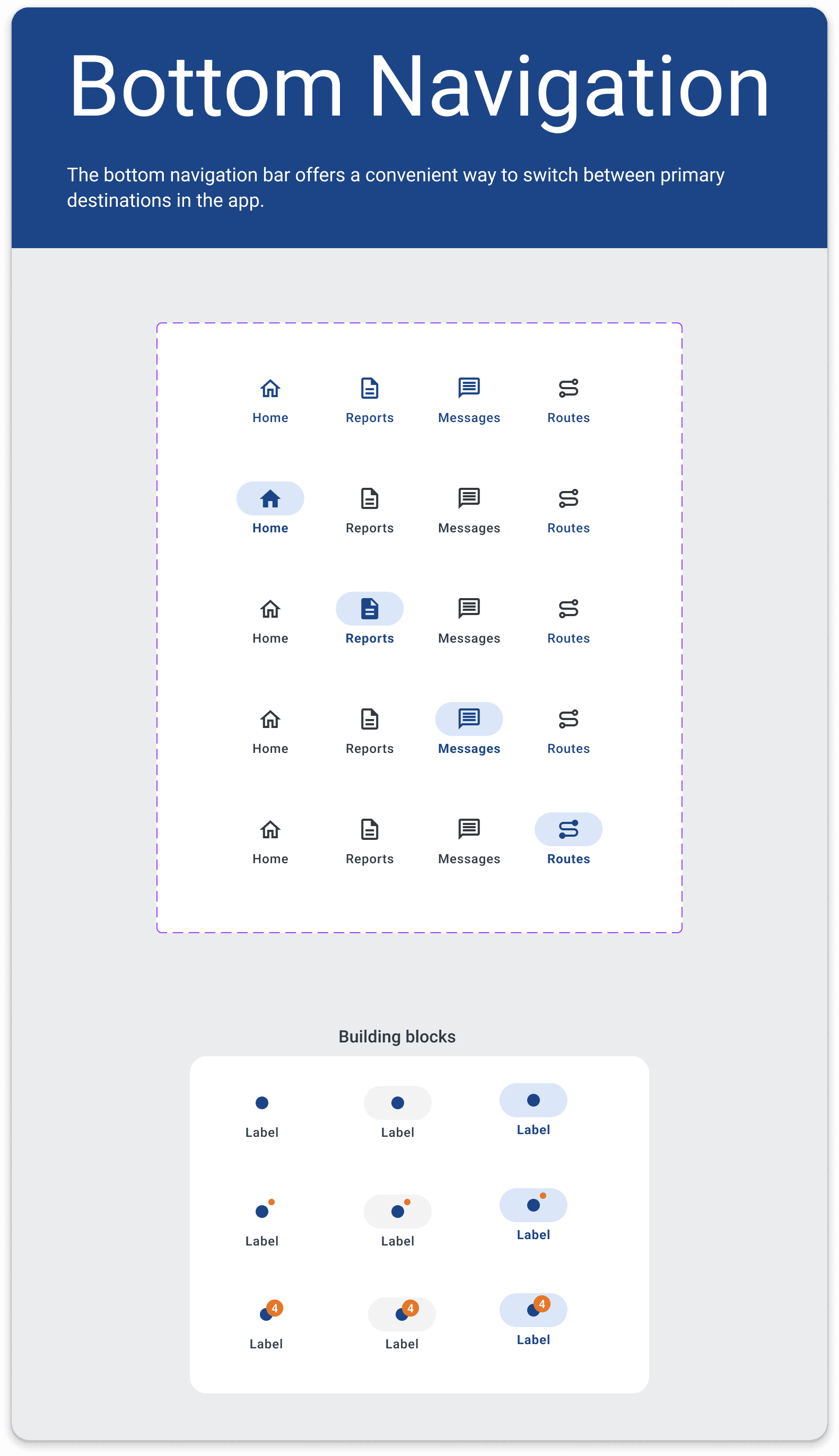


Selected Screens Final Mobile UI + Annotations
The final mobile designs focused on clarity during high-attention moments — route completion, feedback submission, and next-step navigation. Design annotations document rationale and edge cases considered during handoff to engineering.
Details of the three main report statuses: Unclaimed, In Progress, and Resolved


THE DESKTOP EXPERIENCE
The desktop experience was designed for dispatchers and administrators responsible for planning routes, assigning PPOs, and managing daily patrol operations.
Unlike the mobile app, which supports execution in the field, the desktop product supports decision-making, coordination, and oversight. The challenge was to design a system that could handle recurring schedules, last-minute changes, and multiple operational states—without increasing cognitive load.
What are the steps between the dashboard and the mobile app
Desktop - the dispatch management dashboard
Dispatchers intuitively plan the routes, considering areas they know are hotspots for activity, or based on leads from conversations with the police officers.
They post route availability in a group chat in advance.
Shift gaps and unclaimed routes are addressed reactively.
Mobile - The app for PPO to use
PPOs claim their routes via the group chat.
PPOs meet S & M and get briefed about their routes.
They wear their vests, grab a walkie-talkie, and head out on their assigned routes.
If they encounter anything troublesome, they intervene and report it using the mobile app.
At the end of their shift, they head back and sign off a clock-out form for payroll.
The style guide fro desktop
We established a shared system for buttons, navigation, and layout to keep complex admin workflows consistent and scalable. This reduced design friction and allowed the team to move faster across sprints.


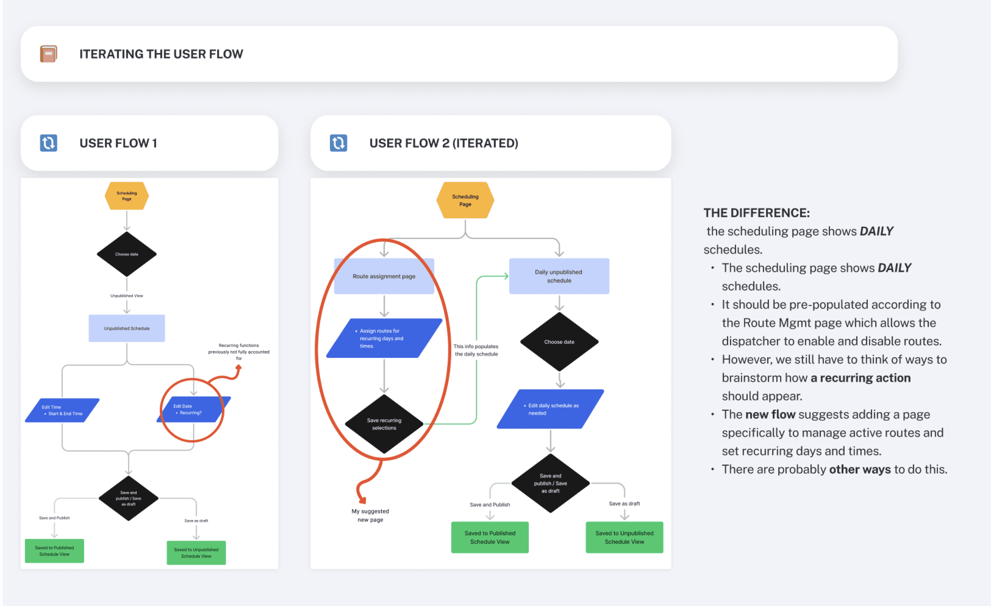
Iterating the Scheduling Flow
Early scheduling flows were too linear and error-prone. Through iteration, we separated route assignment, daily scheduling, and publishing to better match dispatcher workflows and reduce mistakes.
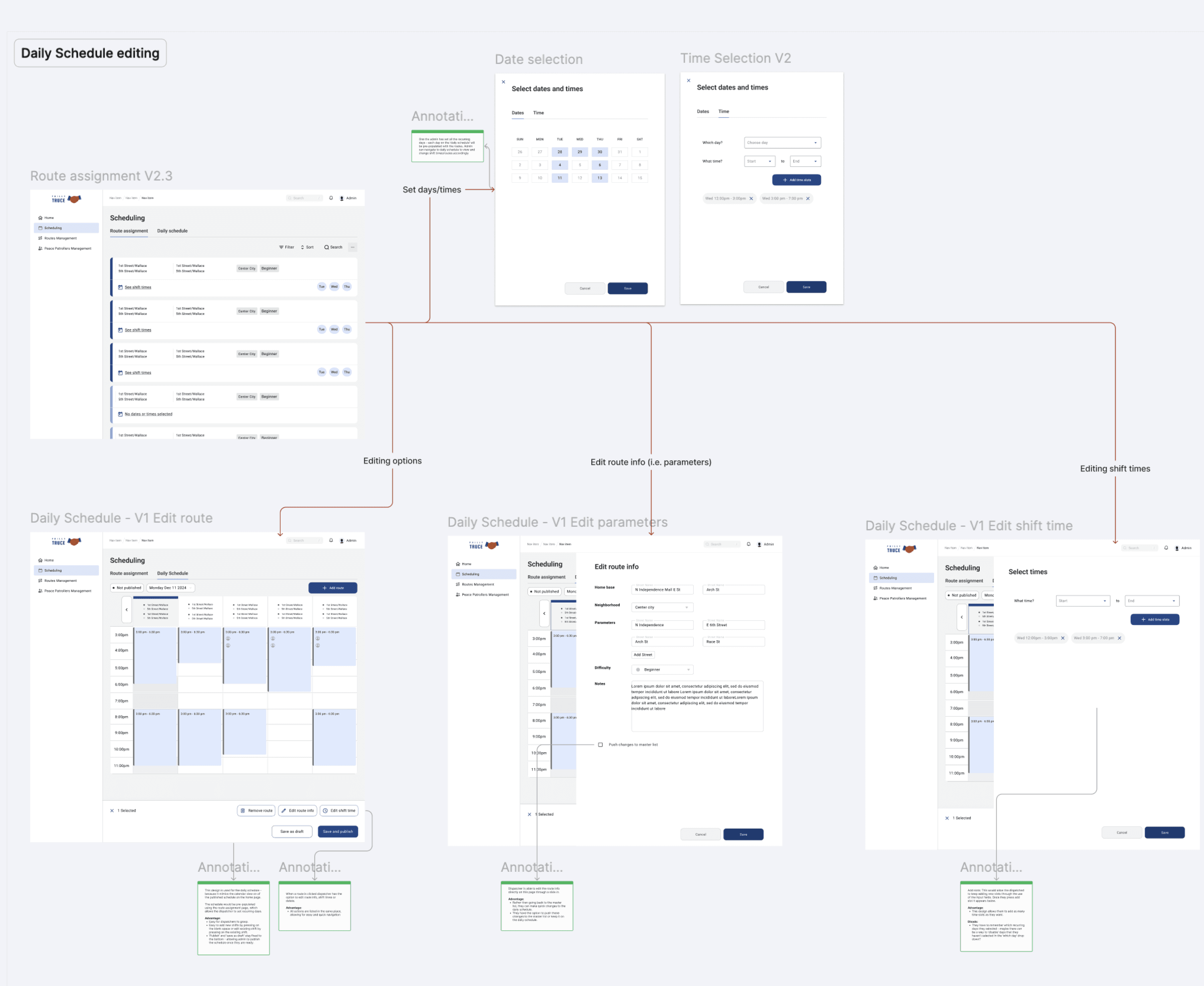
The final UI
We designed a flexible scheduling system that allows dispatchers to edit routes, parameters, and shift times without losing context. Breaking edits into focused actions reduced errors while keeping daily planning fast and predictable.
Conclusion
The desktop experience was designed to support dispatchers in managing complex, time-sensitive operations with clarity and control. By aligning closely with research insights and iterating through multiple user flows, the final solution balances flexibility with structure—allowing teams to plan routes confidently while adapting to real-world changes.